Continuation from Part 1... Let's look at a few more elements.
Navbar
The navigation bar is one of the most important website elements. Some designers make this confusing by over-styling it. A navigation bar is supposed to guide the user not confuse them. Keep it simple and follow best practices.
Best navbars are:
- Easy to understand
- Only includes main links
- Categorizes links with dropdown
- Consistent across all pages
Bad navbars are:
- Takes some time to realize that is a navbar
- The whole navbar is filled with links
- Occupies 1/4 part of the website
Types of navigation menus/bars:
- Horizontal top or bottom menu
- Vertical left or right menu
- Hamburger menu
1. Horizontal
Top nav
This was the most used navbar design so far. Where we put the brand logo on the left and links on the right side of the navbar.

Bottom nav
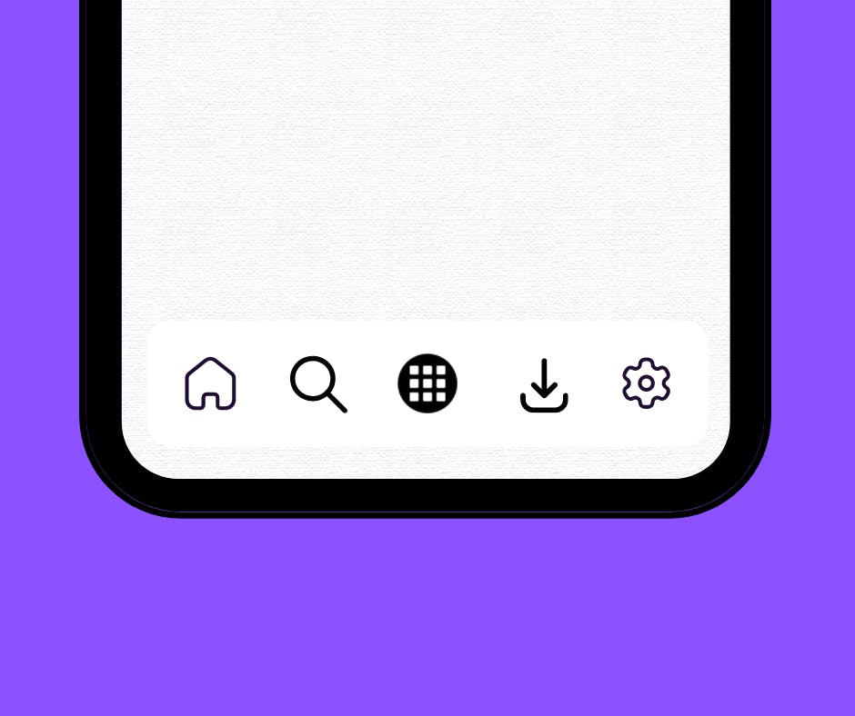
This type of nav is often seen in web apps. Not many websites use this. But very popular in the mobile app world.

2. Vertical
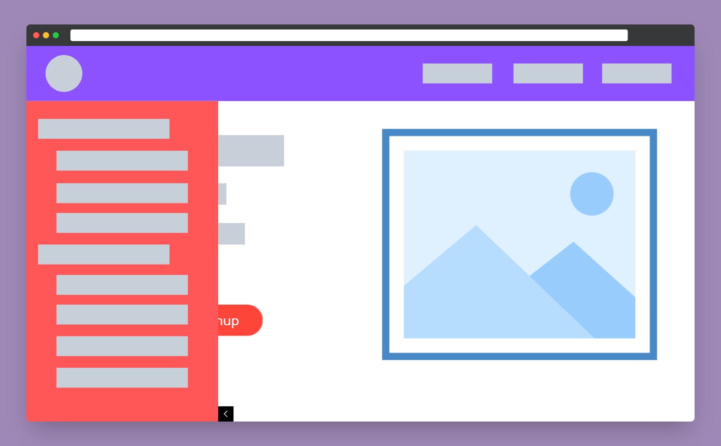
Verticle nav is also mostly used in web apps. Often vertical nav is mixed with top nav. We often find left navigation in documentation websites, e-commerce websites and web apps.

3. Hamburger
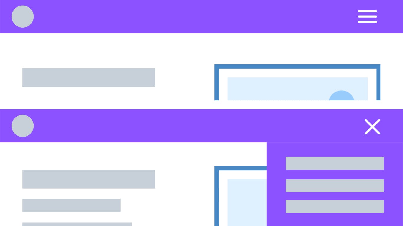
Most websites use the hamburger menu to hide nav elements on small screens but some websites use the hamburger menu by default.

Footer
This was the bottom-most part of the website. Some websites with infinite scrolling put a footer on right or left and some websites don't even consider having a footer.

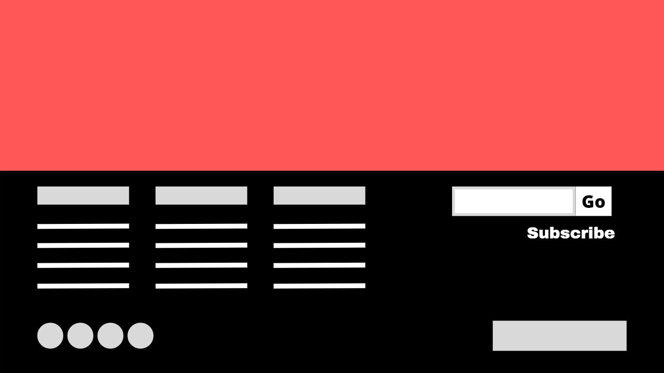
Most websites use the footer as second navigation by putting all the quick links in there. There is no standard design style for the footer, design however you want just make sure you include some must-have things.
Must have things in the footer:
- Copyright notice
- Link to the privacy policy page
- Other legal stuff
Optional but good to have:
- Social links
- Quick links
- Newsletter form with max two inputs
Inputs
Inputs are what differentiated web 1.0 and web 2.0. Same as a button input has different stages.
- Attract the visitor
- Tell the visitor they are in the input field
- Give feedback
1. Attract the visitor
Unlike the button, the input doesn't have fixed styling. You have flexibility over styling.
2. Tell the visitor they are in the input field
This step may not be possible for all the input types. But for some input types highlight the border or something appropriate to that input type.
3. Give feedback
Here feedback is of two types.
- Live feedback - Give feedback as the user types in. Often seen in text input type.
- Feedback after submitting - Give feedback after the form submission.
I covered some of the important elements I have seen people doing wrong. Feel free to research more if you are interested.
Part 1:
I write every week. Follow for more 😇.
